Posted On: Tuesday - May 7th 2024 9:30AM MST
In Topics: Immigration Stupidity US Feral Government Geography
Pretty encouraging?:
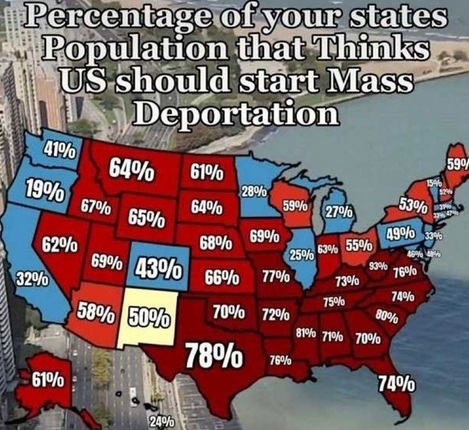
VDare writer Patrick Cleburne stated that he did not know the origin of the map above or polling data from which it's been generated. Mr. Cleburne included the map to illustrate a more particular but also important point about Maine, as his article warns Mass Deportation Opinion Map Explains Rep Jared Golden’s (ME-2) Vote Stunt: Immigration Is Turning Maine Red.
The numbers in the map above are more encouraging than what I'd have guessed. However, firstly, I don't know the exact poll questions - having been polled before, I don't trust this data too much. Secondly, yes, as per Peter Brimelow, "Go West Virginia!". Thirdly, let me state why there's no reason to be seriously encouraged by any of this.
It doesn't matter what the American people want. The US Gov't is and has long been* out of our control! They don't care a whit that their programs are completely against the wishes of Americans as may be shown by maps like this.
PS: I do have to mention minor problems with this work. Sure, the one typo (S/B "state's"), once it's out there on a viral tweet, stays there as a permanent error I guess.
One might wonder why New Mexico is colored yellow. Yeah, 50%, in the middle - I get that. However, as it has with lots of people in my workplace, the distinction between Integers and Real Numbers seems to have been lost. I guess it's possible that, with small numbers, N. Mexico data could be exactly split. Just pick one side or the other then, but it's more likely that the rounding of the data to 2 significant digits was the problem. It's either above or below with real number - no such thing as exactly N.
The guy should have made the shading symmetric. There are 3 shades of red, from within 10 percentage points of 50%, within 20 points, and greater than 20 points away. Therefore, Pennsylvania, Delaware, Rhode Island, Maryland, Colorado, and Washington should be the lightest blue shade, New Jersey, Connecticut, Massachusetts, and California should be medium blue, and the rest dark blue. Hell, make Oregon and Vermont black!
Well, the whole blue/red thing has been backwards for this entire century anyway, so screw it.
* Part 2.
Comments:
Moderator
Wednesday - May 8th 2024 11:28AM MST
PS: Stretch23, did you get done with the Lionel Shriver book?
Moderator
Wednesday - May 8th 2024 9:21AM MST
PS: Thank you, Stretch. Fixed prontomundo. I've got to be honest in that this wasn't so much a homophone error as my not really thinking of the expression before I wrote that. Dang. Maybe Townhall will still have me...
stretch23
Wednesday - May 8th 2024 8:58AM MST
PS While we're correcting typos/spelling, "wit" should be "whit." Another homonym to spoil our day.
Moderator
Wednesday - May 8th 2024 8:56AM MST
PS: Good comment on why the map is fake, Mr. Hail. I did wonder about Oregon vs. Washington and California. Things would be more consistent.
Then too, now I think that the poll data, well, if ANY, may have been taken over a very small sample. Let's say you get data from even 1,000 respondents. That's only 20 people per State, average. You could get some very non-representative averages.
I don't remember the IQ thing (though I've read of people referring to this) - Mr. Sailer has done a nice job in getting the media to back off some various instances of their stupidity - the Charlottesville alleged rape hoax was one of these. That didn't involve any data crunching but just some good common sense.
The Alarmist
Wednesday - May 8th 2024 3:29AM MST
PS
Per capita makes mostly empty states like Idaho look like OK Corral shoot-out Hell holes based on a relatively small number of murders, while actual Hell holes like ChiTown look like a relatively peaceful day at the park.
Per capita makes mostly empty states like Idaho look like OK Corral shoot-out Hell holes based on a relatively small number of murders, while actual Hell holes like ChiTown look like a relatively peaceful day at the park.
E. H. Hail
Tuesday - May 7th 2024 10:34PM MST
PS
-- Remembering the IQ-by-state IQ hoax" at twenty years --
The "IQ map by state" hoax was in May 2004. It was meant to belittle Red State people by supposedly showing their IQs were far, far lower than Blue State voters. Spring 2004: George W. Bush was on his way to being re-elected; the Iraq War was not going well; and there was a sour, resentful mood in the air. Steve Sailer was a power-blogger (at the former isteve.com), a one-man influence machine near the height of the personal-website-based blogging era.
HEY, May 2004. That actually was twenty years ago, and it was at its height about this very week! Someone ought really to remind Steve Sailer, if he is available.
---
Here are some remnants of the original controversy:
https://web.archive.org/web/20040602184421/http://www.isteve.com/Web_Exclusives_Archive-May2004.htm#38115.6465670139
The hoax map/table of IQs, which said Blue States were up to 20 IQ-points above Red States, was published at the time in The Economist, and quickly became an Internet sensation.
It's not clear how or why the Economist let it in, but it is a mark against their editorial scrutiny. They did issue a retraction after Sailer and others debunked it.
IQ being normally distributed data should generally not usually operate with huge jumps from otherwise-similar places with similar population-stocks. People were readily willing to believe the Red State people were stupid, a form of moral-superiority signaling
The IQ-state IQ hoax map also reinforced the "SWPL" thing, the kind of thinking of cultural element that had emerged by this time, which was satirized by the highly successful "SWPL" blog of the time. Those willing to enthusiastically believe the "IQ-by-state IQ hoax" were Whites signaling their own superiority over other Whites.
Over the following fifteen years, and now at the twenty-year mark, you can see further evolution of the force, into a kind of meta-political class hatred, a hatred that is so unmistakable in the USA now. Except with tens of millions more Migrants and "Ilhan Omars" and such active on the scene, active on the one side (very occasionally on the other side, but always for self-serving interests).
E. H. Hail
Tuesday - May 7th 2024 10:13PM MST
PS
-- Why the map is fake --
The easy way to spot that this is a fake, someone made up the numbers, are the wild-and-implausible swings from state to state on what was supposedly the same question, a question which all will have views on (not "Your views on whether to double the number of dog-catchers in Spokane, Washington").
Someone just did a fill-in game based loosely on the famous "Red State, Blue State" map. The numbers do not behave as random data should. Vermont: 15%, vs. New Hampshire, 52%?; and Maine 59%? No.
West Virginia at 93%, twenty-points above every other 'red' state? No
Iowa, 69% vs. Minnesota at only 28%? It's just silly, ridiculous. (Minnesota and Iowa are similar, the "Blue" coalition only modestly stronger in Minnesota, and Trump nearly won Minnesota in 2016, within one measly point.)
Whoever made the map just himself assumes, and assumes everyone else assumes, that "Minnesota" is the same as the deep-core of the "Twin Cities," and even to the district therein, which eventually narrowly, at first) produced the bizarre post-American spectacle of first the Nation of Islam'er Keith Ellison (elevated to the status in a Wokeness-binge in 2006) and now that resentfully anti-American "Somali" Congresswoman (successors of Keith Ellison, elevated in 2018).
Moderator
Tuesday - May 7th 2024 6:32PM MST
PS: Yeah, I've seen that county-by-county voting map before, Alarmist. You pasted it in fairly recently. It's striking.
For the shooting data, firstly, I think only per capita would be meaningful, but also, this would have to get down to precinct level on a map to mean very much. My side of town is very good. You don't have to go far to get to some red dots though ...
For the shooting data, firstly, I think only per capita would be meaningful, but also, this would have to get down to precinct level on a map to mean very much. My side of town is very good. You don't have to go far to get to some red dots though ...
Moderator
Tuesday - May 7th 2024 6:27PM MST
PS: I guess I missed that IQ map debunking, Mr. Hail. I didn't read Steve Sailer regularly back then. I'd think simple polling data would at least mean more than the IQ numbers, which I'm not sure how one would get. OTOH, as I wrote here, polling data can be totally messed up due to the stupidity of the questions.
The Alarmist
Tuesday - May 7th 2024 3:07PM MST
PS
The 2020 Presidential election, by county:
https://drrichswier.com/wp-content/uploads/RED-BLUE-COUNTIES-2-504x284.jpg
Prevalence of Gun violence:
https://www.miamiherald.com/latest-news/gc5ejr/picture237395534/alternates/FREE_1140/14c00d51-0b8d-4dd6-a71e-0caa61f54155.png
The 2020 Presidential election, by county:
https://drrichswier.com/wp-content/uploads/RED-BLUE-COUNTIES-2-504x284.jpg
Prevalence of Gun violence:
https://www.miamiherald.com/latest-news/gc5ejr/picture237395534/alternates/FREE_1140/14c00d51-0b8d-4dd6-a71e-0caa61f54155.png
E. H. Hail
Tuesday - May 7th 2024 11:16AM MST
PS
Yes, the map looks completely made up; --- similar to the hoax of "average IQs by state" map released ten or more years ago, which Steve Sailer (p.b.u.h.) debunked at the time.
Yes, the map looks completely made up; --- similar to the hoax of "average IQs by state" map released ten or more years ago, which Steve Sailer (p.b.u.h.) debunked at the time.