Posted On: Tuesday - June 3rd 2025 10:59AM MST
In Topics: General Stupidity Pundits Media Stupidity Science
Note: You must say that "yeaaaahh" in your head in Steve Sailer's interview voice. It works better that way.
Peak Stupidity and probably most readers here would have read or heard from Semi-Deplorable pundit Steve Sailer on his revelations of the George Floyd Martyrdumb having resulting in lots more Black! deaths than the averages before that fatal date with Fentanyl Dustiny.*
These deaths have been in the form of more black-on-black murders and more fatal car wrecks. We, based on the NOTICING by Steve Sailer, can determine that both were due to the same factor, the lack of police presence. The cops spent even MOAR time at the doughnut shops. Well, your Peak Stupidity lead blogger is no sycophant and big supporter of the "men in blue". (Note the lack of a blue & black stripes emblem up top.) Too large a share of the police are about the same level of crooked as George Floyd was, yet, black men seem to act worse without a strong police presence. That's yet another observation by Mr. Sailer that I can confirm.
Anyway, I've heard about this and seen the graphs enough times now. This post is about graphs themselves more than the data and revelations by Mr. Sailer. The NY Times has gotten into the Black! Death Increase story and pretty much butchered it due to erroneous/misleading graphs.**
See, Steve Sailer really hates it, and rightly so, when the Lyin' Press he reads come out with stories that he's already looked into in depth and butcher them. The question he and his commenters (and the old REAL Deplorables in his Unz Review iSteve Open Threads) have is do the NY Times writers incompetently "butcher" these graphs or is it malice. I'd put it as stupidity v evil, a contest of competing factors that we witness often.
Let me get to the graphs, because in iSteve's posts about it, I think there's something regarding the graphing technique that neither he nor any commenter has gotten straight. The first post (both hankfully not paywalled) was Happy 5th Anniversary of the Racial Reckoning. He pointed out stupidity/evil of this misleading graph:
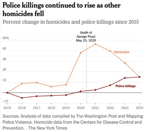
His follow up post, written after he wrote a letter to the "Newspaper of Record" corrections dept. (the writer or editor, I guess), is about their attempt at a correction. That was to done I guess to both save being eviscerated even more on AntiSocial Media and placate iSteve. He's spent a lot of time on this and gotten it right. I'd be rightly pissed and doggedly get on these liars or incompetents. He wrote The NYT Corrected Its Ludicrous George Floyd Homicide Graph ..., but nobody is happy with the correction. They just took out the freaking vertical George Floyd Martyrdumb line to show that "We dunno. Shit's gotten bad." (Graphical displays of burrito coverings inventory are hopefully forthcoming.) I'm not even going to show this one. Just picture the above without the Floyd line and label.
Mr. Sailer assumes incompetence, but he's a nice guy. He writes out of (in, actually) a closet and has a nice dog. About the initial NYT graph, he wrote:
The usually competent graph designers at the NYT placed the dashed vertical line indicating Floyd’s death after the 29% increase in homicides in 2020, when the large majority of the explosion in murders followed the cultural revolution of May 25, 2020 as the cops retreated to the donut shop.(I'll forgive the lazy-assed spelling of doughnuts just this once.)
Mr. Sailer, from his 2nd post, after the "correction" (he also pasted in his nice, as usual, letter to the Editor):
Your graphic artist made the obvious mistake of creating a line graph that attributes all homicides of 2020 to January 1, 2020, so the vertical dashed line for Floyd's death follows rather than precedes the big surge.A " cosmetically improved version" of his much more revealing ~ weekly data with bi-monthly (every-8-weekly) tic marks - graph is this:
In contrast, here's my graph of weekly CDC mortality data of black homicide and motor vehicle deaths from the beginning of 2018 to mid-November 2024 (the CDC imposes a 6 month lag on reporting murders and car crashes to let coroners have time to do their work).
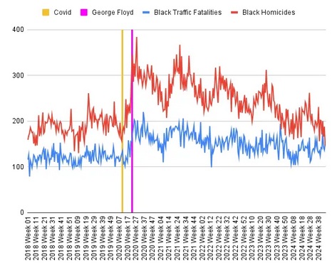
OK, look, I've written this before. It's 1/4 of a CENTURY into the 3rd Millennium now. Can we quit writing, and especially SAYING "twenty twenty x" yet?! His labels on his x-axis would be a little cleaner without extra characters. [/micro-rant]
Here's the problem in the first place. The data of deaths compiled by the NY Times are for deaths at end-of-year. I can see where you would want a cleaner graph, only yearly than Mr. Sailer's one. Here's where the 2nd stupidity v evil question comes in. (I'll get to the 1st last.) Did they deliberately go with yearly data to obscure the important point of Steve Sailer's? More importantly, did they make the graph with end-of-year tic marks WITHOUT labels purposefully to "fact check" any correlation that Mr. Sailer made? Was that stupidity (incompetence) or evil (lying)?
I read plenty of comments by people generally seeing the problem. The Floyd Martyrdumb happened on May 25th of '20, 40% of the way through that leap-year. (Yeah, to get more accurate.) That's where the vertical line is, so "What's the problem again?" - NY Times writers. Yeah, but the deaths for all of '20 are at the '20 tic mark, which most people would figure is the start of the year. This is the point that nobody seems to have made well... till now.*** It's not just about the resolution of the time-scale.
Obviously, Mr. Sailer's graph fixes the problem. If you want to be truthful, you just paste that in. However, and I'm being very generous to the NYT here, if you want that cleaner, simpler graphs, you can either do this:

Or this:

I cropped out both the main title**** and the source information from these 2. The latter would be the same, of course, but the big main title might have to change, which is a real problem...
I like the 2nd one better. With my 1st, I can see readers arguing (no, not you guys, NTY readers), "No, he died a year later. You got it wrong." No, that's the end of '19, see? May of '20 is after that, 40% of the way to the end of '20.
On the 2nd, there'd be no such argument. I suppose one might argue "The deaths for '20 are way higher!" No, but that the start of '20. See the '21 tic mark and data points? They reflect the data for the year '20, which is the start of '21, is it not?
Or, they don't care and are just evil liars. Let me get to that 1st point of asking the question, stupidity (incompetence) v evil (lying)?
From the very beginnning could the NYT writers not have made some effort to search for (or on X – I don’t partake, so would they very obviously have heard of iSteve?) the info that Mr. Sailer has written and spoken about HUNDREDS of times? Could the writers have possibly tried and missed getting his information? There’s censorship by the “fact check” sites, in which the true stuff is relegated to page 8 of search results, but really, could they not have easily found the weekly graphs?
If the NTY purposely ignored Steve Sailer and just made their own graphs anyway, I’d call that evil already from the get-go. After that, one could lie with graphs or else just let incompetence take the ball from there.
PS: As commenter Ralph L. noted on TUR, a bar graph would be best for this data, which is just yearly totals. However, then you can't make the point about the Floyd mark very easily. (Put a line between the '19 and '20 bars, I guess...)
* Does it come in dust form, I mean if you like it that way? I dunno... I'm tryin' to make a pun here so cut me some slack.
** In this case, they didn't get into the car wrecks, but displayed police shootings, as that was what their narrative was apparently about. (I don't read the NYT, with VERY rare exceptions. THIS is why.)
*** That's just my opinion - maybe I didn't get the gist of some of the commenters' writing. There will be more comments too, so ...
*** I like that method, having a Main title and then a sub-title that states something about the numbers being measured. In this way, you don't need a label for the vertical axis.
********************************
[UPDATED 06/03 evening:] Fixed typo (40%, not 49% in one place, noted that the 2nd curve was police killings by adding (what is now) the 2nd footnote. Also, iSteve's data is weekly, but just the tic marks are every-8-weekly. Finally, I noted that a bar graph is best for data that is only good to the year, as one can't assume anything from the graph shape between years.
********************************
Comments: