Posted On: Friday - July 7th 2017 10:15AM MST
In Topics: Immigration Stupidity Websites University California Global Financial Stupidity Economics
(By "minorities", in this case we mean non-rich regular Americans, who will indeed soon be minorities in the parts of these areas that people want to live in.)
This is more information that could be gleaned from regular readings of Zerohedge and sites like that over the last few years. Peak Stupidity would like to give a shout-out, if you will ("shout-out", only phrase heard from Øb☭ma that I liked) to a site called Seattle Bubble that this writer first perused way back in 2005. By the name, this guy, called "The Tim", writes specifically about Seattle, Washington, but he covers the overall scene with housing prices in his graphs - more about them shortly.
I will say that The Tim did call out the ridiculous bid-up of housing in Seattle and the west coast before things went down the first time. His site clued me into the real state of financial things by leading me to the Calculated Risk blog (OK, I recall, but most of the commenters were flat-out Communists, Commo-commenters, if you will!), which led me later on to Zerohedge, one of our favorites, of course. I will first write a few things about the Seattle Bubble site, then a few things about the data to be displayed on changes in median housing prices.
SeattleBubble was interesting early on, but the posts were geared toward people living in Seattle, or King County, or surrounding counties of course. Besides discussing the ridiculousness of the prices (till 2007), the state of housing in the area during the big decline (2008 - 2013), and then the reasons for the new sharp rise again (2014-Present), the site is geared toward people into real estate as a business. Most of the commenters, in fact, would only be interesting to readers in Real Estate, one of the unproductive large areas of the American economy, as part of the FIRE sectors (see 5th paragraph and down). In addition, a majority of the commenters are fairly leftwing and clueless, which shows when any kind of politics come into discussion - that'd be expected, I guess. Nowaday, I look forward only to reading the monthly post with graphs from Case-Shiller data on housing prices for 20 metropolitan areas of the US. Granted, this data can be read elsewhere - from the 2 guys Case and Shiller, if nothing else. The Tim has some really well-presented graphs in his posts each month, that haven't changed format (which I like) and use software called Tableau that enables user control of the graph on-line - oh, that doesn't work on slightly older browsers, like a lot of stuff!
Now, about the data: There are a few things one must understand or his impression of the housing numbers from the Case/Shiller monthly numbers will be wrong. Here ya go:
1) All of the cities' housing prices are given as the median value, as opposed to the average, or mean. This really makes sense with this kind of data. Most buyers are buying ONE house out of thousands, and a few very high-dollar mansions being sold can skew an average. The median, for the statistically-declined, means the value at which 1/2 of the other numbers would be higher than it and 1/2 lower.
2) All of the city's median housing prices have been normalized to a value of 100 at the beginning of 2000, at a time when these guys considered housing bubble 1.0 to have started. This means that, though the median LA price and the median Charlotte, NC price were way different at that time, they both show 100 on the graph. The idea is to enable people to compare not actual prices between cities, but relative rises and falls based on that "initial" value, before any bubbling.
3) This last point is not particular to Case/Shiller data, but the housing market in general, for most parts of the country, gets better (more sales and higher prices) in Spring and Summer than in Fall/Winter. It may be a matter of more people getting out and around or something about jobs/schooling and moving. Who cares, but the yearly waves in most of the graphs are not noise, but real. It's the long-term trends that are more important.
With that being said, the point of this post is to point out the areas that are particularly seeing this 2nd housing bubble. The following graphs are just screenshots from the SeattleBubble site, so not interactive. In addition, they are more than 1 month old now. The new graphs, showing data through end-of-April, was presented in late June, and can be viewed and played with there. Remember, the indexes shown are not relative to other cities, just to the median price in that city back in 2000.
(Phoenix should not appear here also - I cannot correct this right now, sorry.)
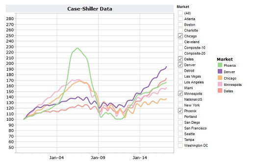
None of these cities had a real, serious out-of-control bubble back the first time, circa 2007. Though Denver has gone quite a bit up lately, note that it's index of 190 means prices are up 90% since the year 2000. That would be an increase of just over 4% yearly compounded, which is not at all out of line with real (not US Government published) inflation numbers.
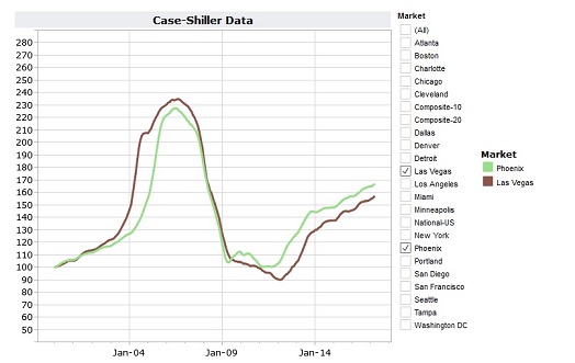
These two cities, in what Steve Sailer (of unz/Vdare) calls the "sand states", had a huge bubble last go around. It had to mostly just pure get-rich-quick speculation, and I personally know someone involved who lost mucho monero getting in the scheme at the wrong time - or, really, getting out at the wrong time. Though prices came out of their steep dive and trough in 2013, the increase in the last 3 years are not ridiculous. Have people learned not to speculate? I mean, you can get to the real casino pretty quickly from both these locales.
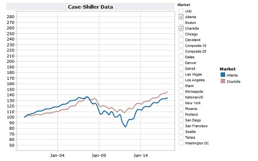
These 2 Southern big cities never had anything really unreasonable going on. The dip in Atlanta toward 2012 bring prices down to 80% of a dozen years earlier was the worst of it.
(Trust me, I didn't pick the colors - Washington, FS is the light blue-gray one with the higher-up indexes throughout the x-axis.)
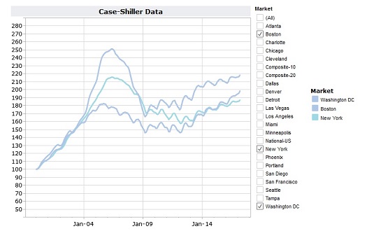
NYC and Washington, FS are the big money cities. NYC as King of the Finance "industry, first of the FIRE methods of
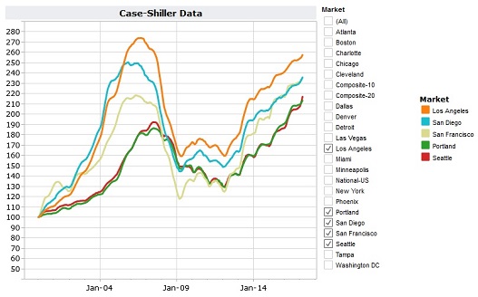
AHA! WTF? These West Coast cities saw huge peaks in housing prices in 2007, as there was much speculation, but the down slides never got as low as Vegas and Phoenix, or even the Midwest/Mountain West, which got down to 2000 levels. The big thing to notice is that these cities are really undergoing bubble 2.0 with a vengeance. In fact prices in Seattle, Portland, and San Fran have all gone higher than the peaks of bubble 1.0. OK, it's nice out there, when the sun ever shines, but it's been that way. What's new and special about the West Coast? I'll tell you - it's closer and more familiar to the folks with the big bucks over in China. There is a whole lof of foreign-collected US Dollars being spent, as Peak stupidity has already discussed here.
Word on the
There are plenty of people in Real Estate who may love this sort of thing. People who are ready to get the hell out of these cities, for whatever reasons, may also be grateful for this influx of foreign cash. It is not good for an average American who just wants to stay and live a decent life. California has gone through this years ago, but know that, even though you're "locked in" with the price you paid, and can get nice big home equity loans or lines-of-credit for vacations and SUVs , your property tax will go up accordingly. This rent-from-the-State deal will not end. Can't come up with the money? See you, get the hell out of this city.
What about Boston, and what about the University towns per the post title? That'll be the the material in the next post on this, hopefully tomorrow.
Comments: