Posted On: Wednesday - June 20th 2018 9:34AM MST
In Topics: Global Financial Stupidity Economics
As I copied some housing price graphs off of the website Seattle Bubble a few days back, I realize now that it's been just under a year since our graph-filled post entitled Housing Bubble 2.0 - West coast, university towns, minorities, to be hardest hit!. It's good timing, though the Seattle Bubble site itself puts out this data in the nice "tableau"-software graphical format based on Case-Shiller housing data monthly. It's pretty much the only reason to visit that site, unless you live in Seattle, are a realtor, or are thinking of buying housing out there. From the year-ago post:
SeattleBubble was interesting early on, but the posts were geared toward people living in Seattle, or King County, or surrounding counties of course. Besides discussing the ridiculousness of the prices (till 2007), the state of housing in the area during the big decline (2008 - 2013), and then the reasons for the new sharp rise again (2014-Present), the site is geared toward people into real estate as a business. Most of the commenters, in fact, would only be interesting to readers in Real Estate, one of the unproductive large areas of the American economy, as part of the FIRE sectors (see 5th paragraph and down). In addition, a majority of the commenters are fairly leftwing and clueless, which shows when any kind of politics come into discussion - that'd be expected, I guess. Nowaday, I look forward only to reading the monthly post with graphs from Case-Shiller data on housing prices for 20 metropolitan areas of the US. Granted, this data can be read elsewhere - from the 2 guys Case and Shiller, if nothing else. The Tim has some really well-presented graphs in his posts each month, that haven't changed format (which I like) and use software called Tableau that enables user control of the graph on-line - oh, that doesn't work on slightly older browsers, like a lot of stuff!I will now also excerpt another chunk of that year-ago post, only because I don't want readers to misinterpret these graphs:
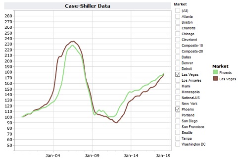
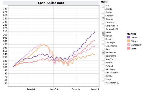
1) All of the cities' housing prices are given as the median value, as opposed to the average, or mean. This really makes sense with this kind of data. Most buyers are buying ONE house out of thousands, and a few very high-dollar mansions being sold can skew an average. The median, for the statistically-declined, means the value at which 1/2 of the other numbers would be higher than it and 1/2 lower.I have 7 graphs here, each for a different region of the US. The Case-Shiller data are only presented for 20 cities, so some regions of course don't have big samples.
2) All of the city's median housing prices have been normalized to a value of 100 at the beginning of 2000, at a time when these guys considered housing bubble 1.0 to have started. This means that, though the median LA price and the median Charlotte, NC price were way different at that time, they both show 100 on the graph. The idea is to enable people to compare not actual prices between cities, but relative rises and falls based on that "initial" value, before any bubbling.
3) This last point is not particular to Case/Shiller data, but the housing market in general, for most parts of the country, gets better (more sales and higher prices) in Spring and Summer than in Fall/Winter. It may be a matter of more people getting out and around or something about jobs/schooling and moving. Who cares, but the yearly waves in most of the graphs are not noise, but real. It's the long-term trends that are more important.
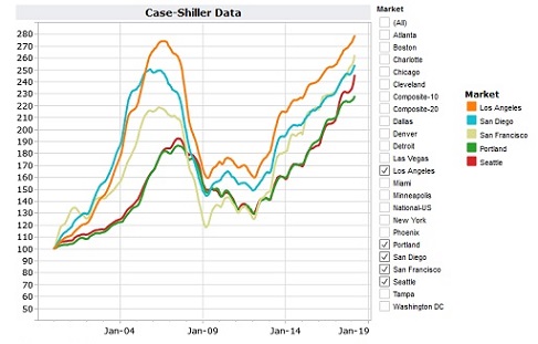
As discussed herein, there is lots of foreign money coming into these locations and put into housing as an investment and foothold. Most of it is Chinese money. This does not look like it's been abating one little bit. Look at Seattle! Peak Stupidity also discussed the parking of this Chinese money all over the (especially) English-speaking world in Selling out the country - Aussie and Canook style.
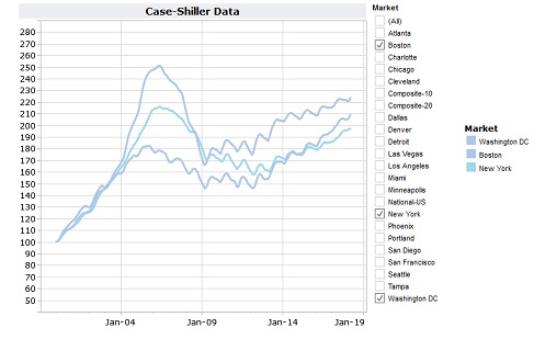
New York always has the Big-Money money (the initial "F" in F.I.R.E. economy), and Washingon, FS (oh, Federal Shithole for you PS newbies) has all of OUR money that we apparently have to spare. Boston has lots of old-timey money too, and is a pillar, or to stick with the metaphor, a big gas source of the University bubble. Keep in mind caveat #2 above in interpretation of the data. This real estate may be the MOST expensive - the graphs show the rise/fall/rise in relative terms for each city.
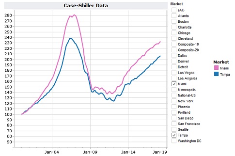
Florida and cities of the "Sand States" below, were big players in the purposeful use of housing as a speculative investment vehicle (that's a money-man term, "vehicle", I mean WTF?) back in HB 1.0. I knew people involved in this in Florida and in Arizona. I don't feel sorry for either of them in their losing of their asses.
Like I said above.
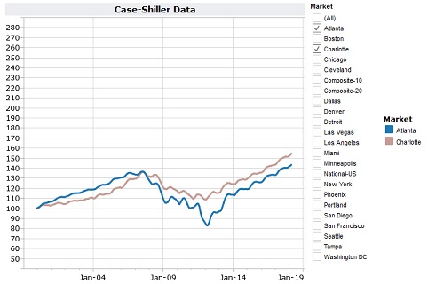
It's just steady as she goes. There's never been a whole lot of big money in the Southern cities. The manufacturing that came down 50 years ago has mostly high-tailed it to China. The newcomers consist of lots of black from up north who don't bring much money with them. The Californians (most of them bringing their cntrl-left socialist ways with them) don't usually make it to the South, as the serious humidity and bugs are not a welcome change from the West. They've mostly infested the Pacific NW and Texas so far. It's a good thing, really, as it still doesn't take as much money to live down South as it does in much of the nation. The University towns, as in all of the country, are a different story, but Atlanta, Georgia, and Charlotte, N. Carolina are not particularly university towns.
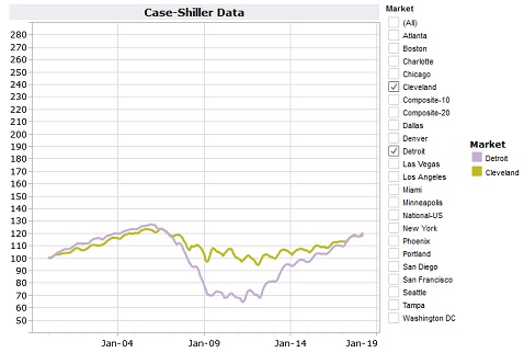
Cleveland never did as badly as Detroit at the bottom, probably due to slightly better demographics. However, even the Continental (now part of United) Airline hub is no more. That can be a big loss, as there are billions of dollars flowing at a major airline hub. Anyway, these are the epitome of the Dem/Black/Union destroyed rust belt cities. Both of these place have "good deals" on housing due to not very good reasons to live there anymore. What were you expecting, Paris on the Erie?
How is this one going to end? Are people really making that much more money in order to afford a lifestyle that includes payments for these "homes" or are they again counting on them as savings accounts that are earning 10% annually (beats hell of of the FED-induced < 1% CD rates)?
Let's compare these increases to inflation. The index had a value of 100 for all of the cities as defined by Case-Shiller for the year 2000. That year was considered to be a time before any serious bubble in housing prices. If we believe the 1.5 - 2% annual inflation rates as told to us by the Feral Gov't (we don't) than anything over 140 or so in 2018 has risen higher than general inflation. My comparisons of prices of food, insurance, vehicles, etc. give me a gut feeling of more like 4 - 5%. Any numbers below 220 or so, then, are not really very high. That means only the West coast is really getting out of whack. The Midwest, Florida, and the desert seem not unreasonable, and the South cheap still. Detroit and Cleveland? We don't want to go there. No, that wasn't an expression - I mean, literally, WE DON'T WANT TO GO THERE!
It's the way that lots of these curves are rising, though, that still make lots of this housing-as-an-investment business still a bubble.
Comments: